How To Create Mega Menu: Best Practices and Design Tips
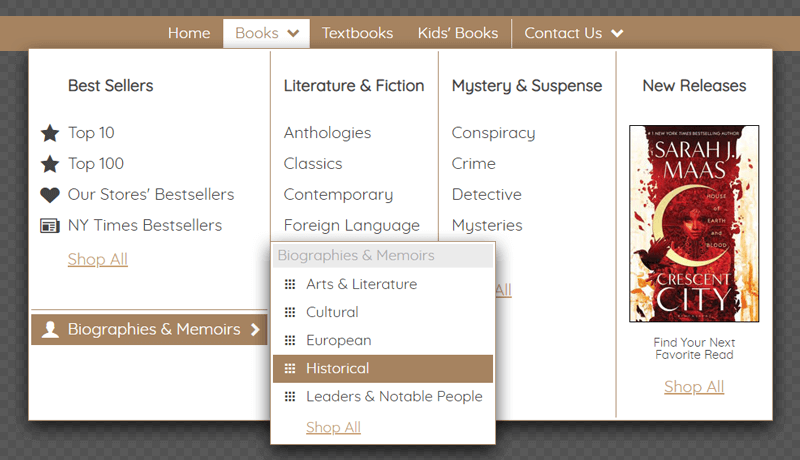
Having the best products is no good if people can’t find them. To create sales, you have to make sure your website navigation is in order. One form of website navigation that is getting more and more popular is the Mega Menu. Mega Menus are a fantastic method of showing a range of options in a concise way. They function by combining a few traditional vertical navigation menus into one large panel.
This type of navigation structure allows users to browse a plethora of links without leaving the page. Visitors can move between different product categories with just a click of the mouse. What does this mean for you as a business owner? Faster conversion rates and more time spent browsing your site. Also, your website will be more user-friendly.
Mega menus have been around since 2013. They increased in popularity a lot back then and still are very commonly used today. They are also referred to as mega dropdown or mega flyout menus.
This article will walk you through the mega menu in detail. I will tell you what parts it consists of and how to easily and quickly create a mega menu shown in this example. You can load this example for editing or create a new one from scratch using Dropdown Menu Generator - an online application. It includes easy-to-use tools with drag-and-drop functionality and requires no design or programming skills.
Multi-Column Layout
The basis of any mega menu is a multi-column structure. Each column can include standard links, images, texts, groups of elements, and specific objects such as data entry forms, widgets, or interactive components like maps, diagrams, etc.
In the online application, you can easily split submenus into multiple columns. In our example of the navigation for a book store, you need to select the "Books" item and enable the option "Submenu Options" -> "Multi-column submenu".
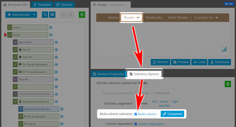
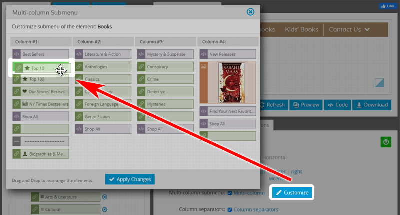
To place elements in columns, click on the "Customize" button and compose your layout by simply dragging and dropping elements.
List of Links With Title
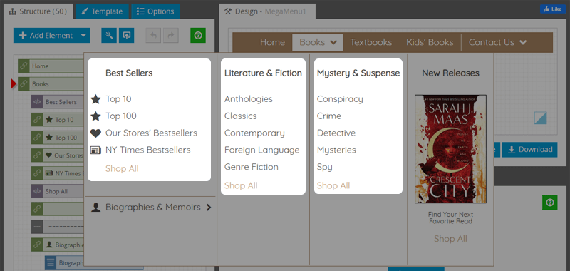
The list with a title is the most common type of data used for mega menus. It can be a group of products or services, usually displayed in alphabetical order. Usually, the list with a title is a vertical set of items in which each element includes a text or link to a page. The first item in the list is typically highlighted or otherwise marked as important and is referred to as the "title" of the list.
In our example of the mega menu for the bookstore, the categories "Literature & Fiction" and "Mystery & Suspense" are lists with headings. The column "Best Sellers" is also a list of navigation links supplemented with icons.
Dropdown Submenus
One of the popular features of navigation is a drop-down menu. It can be used to display additional items that are not visible at the top portion of the menu. The list is activated by clicking or moving the mouse pointer over a specific item. An advantage of using this type of list is that it can provide additional links on demand. In other words, it allows displaying more specific data where needed.
In our example, the "Biographies & Memoirs" item includes the list to expand and display the related items "Arts & Literature", "Cultural", etc. This approach helps save space in the main mega-menu area.
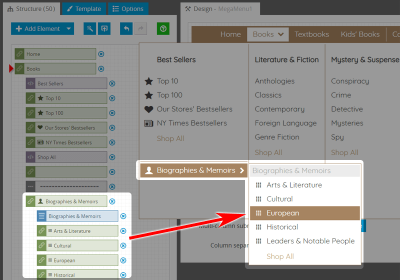
To make an item as a child for the parent element, just drag it and put it to the same location with a small indent on the left.
Images
A picture is worth a thousand words. An eye-catching graphic emphasizes the destination immediately, and when users see an image, they associate it with the content inside a page. Navigation Menu with images communicates instantly as the brain interprets images much quicker than text. It is vital for increasing the efficiency of a website and consequently increases conversion rates.
To add a picture to your mega menu, click the "Add Image Element" button and upload the PNG or JPG file from your machine. The image becomes a part of your menu.
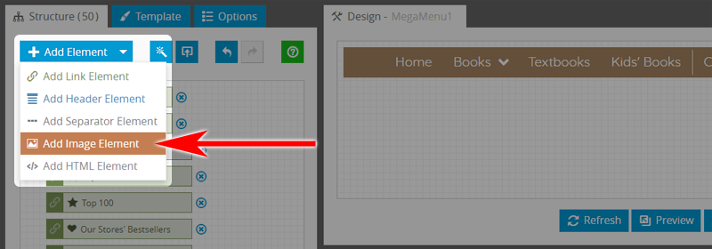
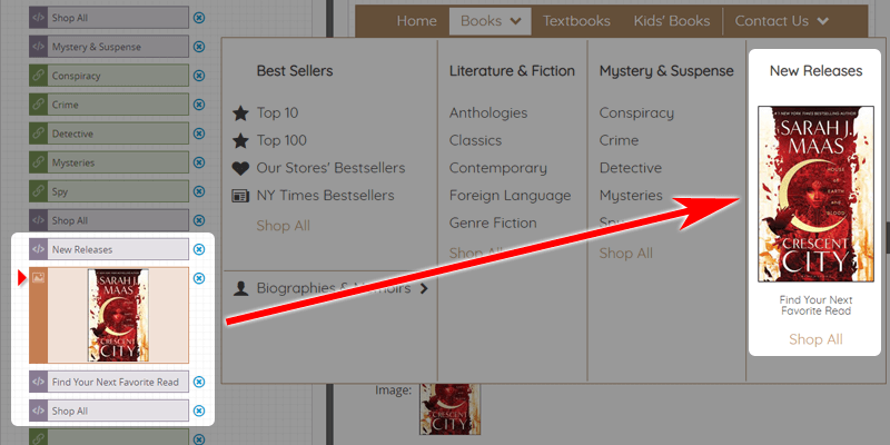
Very often, a picture with a description may be used as a Featured Product.
Featured Product
The "Featured Product" is a great way to get maximum exposure for a specific product or service on your site. It will encourage visitors to add the item to their shopping cart.
Featured products command premium placement in shopping carts. It also makes the e-commerce website more attractive to the customer and encourages purchases. There is no reason why a common product can't be featured just like a rare product. On average, featured products increase sales by 15-20%.
In our mega menu example, the featured product is in the last column under the "New Releases" heading. In addition to the cover image, it also includes descriptive text and the "Shop All" navigation link. Each part of the product is a separate item by the Link, Image, or Header type.
Contact Us Dropdown
The Contact page plays an important role in turning your website visitors into your customers. If visitors to your website found it hard to look for all your contact details, you will inevitably lose them as potential customers.
In our Mega Menu example, the "Contact Us" item is in the main bar. It includes the two-column submenu. The first column contains the Google Map with the location. The second column contains the postal address, hours of operation, e-mail addresses, phone numbers, and social media links.
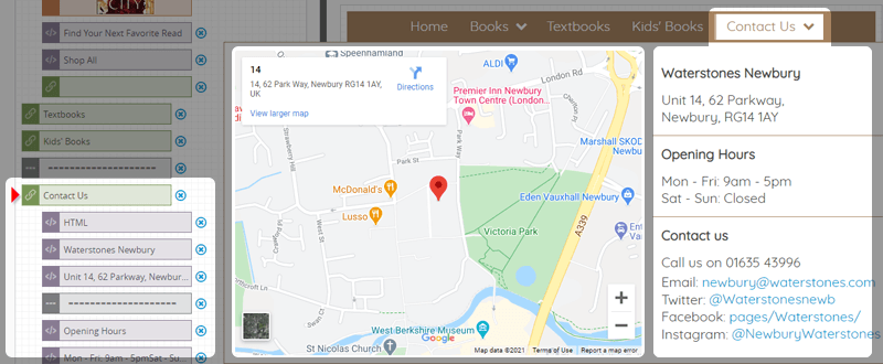
Google Map gives a direct illustration of your office location. It saves your customer from going through a random path in finding out where you are based. Let your customers know you are always just a click away!
Add Mega Menu To Web Page
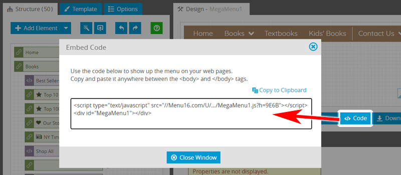
Once you've finished creating the menu, you need to place it on the pages of your website. It's easy to do - copy the menu code to the clipboard and then paste it anywhere in the page code.
Conclusion
Website visitors like to navigate through a site using mega menus for two reasons — accessibility and usability. Mega menus help users more quickly find what they're looking for on a site, thereby improving the user experience. They also make it easier for site owners to sell more products.
The easiest way is not to create a mega menu from scratch but to take a ready-made project and make changes. Just open any of these examples in the online editor and change the links, labels, add/remove/rearrange the elements, add images, choose the font, and set colors. If you need a hand, do not hesitate to contact us.
Links