How To Add A Mobile Responsive Dropdown Menu In Blogger
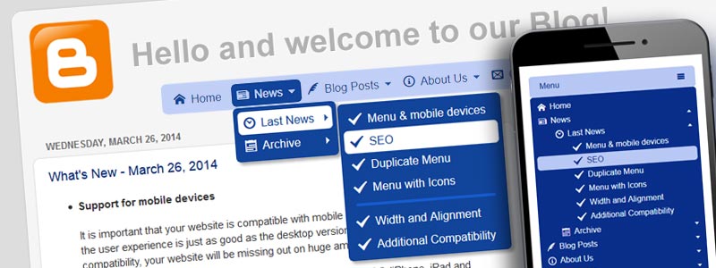
In my previous blog post, I described how to add Dropdown Menu in Blogger. That post describes the basics for creating a menu and adding it to the desktop version of your blog. This post expands on this scenario by adding your existing menu to the mobile version of your blog.
Let's start
First of all, we need to take into account that Blogger uses a separate template for mobile layout. If your blog is opened on a mobile device, Blogger displays it in a compact view optimized for small screens. A mobile template has a logo, a simple dropdown list for navigation, and the list with blog posts.
Our task is to make the current dropdown menu user-friendly to mobile visitors and add it to the mobile template.
Step #1: Enabling the Responsive Menu Option
A responsive menu is such navigation component, which is user-friendly for both desktop and mobile users. How does it work? If the viewport width is less than the width of the menu bar, an alternate compact menu appears. So, the menu provides a quality experience for all of the users.
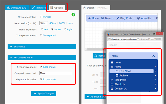
By default, the menu created in Dropdown Menu Generator is not responsive. To make it responsive, you should enable the "Responsive Menu" option under the "Options" tab. To be sure that the menu is responsive, open it in the preview window in Menu Generator and set the window width less than the width of your menu.
Step #2: Adding to the Mobile Template in Blogger
As you use Embed Code, your blog already has the responsive menu because any modification made to the menu in Menu Generator is immediately reflected in the menu on your blog.
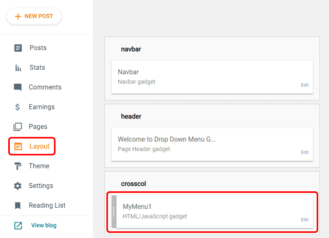
Open Blog Layout and find the widget with your menu. In my example blog, the menu is in the "MyMenu1" widget.
Next, click on the "Theme" link and open the main template in HTML mode for editing. Find the "MyMenu1" widget and add the mobile='yes' code:
<b:widget id='HTML2' locked='false' mobile='yes' title='MyMenu1' type='HTML'> ...
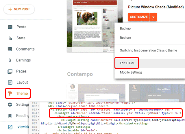
Now the menu widget is enabled for the mobile view.
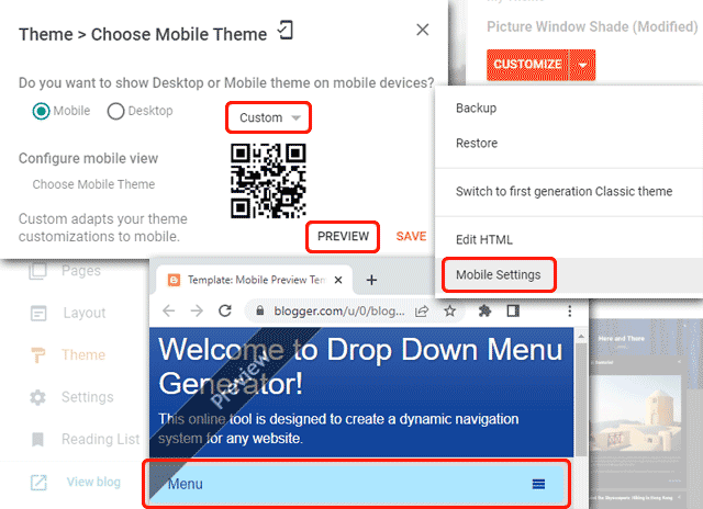
Finally, click the "Mobile Settings" and choose the Custom Mobile Theme. Click on the Preview button to see the mobile version of your blog which now displays your responsive menu under the header. That's All!
Conclusion
A single menu instance is used for both desktop and mobile versions of your blog. Any modification made to the menu for desktop users will be immediately reflected in the menu for mobile users.
If you have any questions, please use the Question Form.
Links